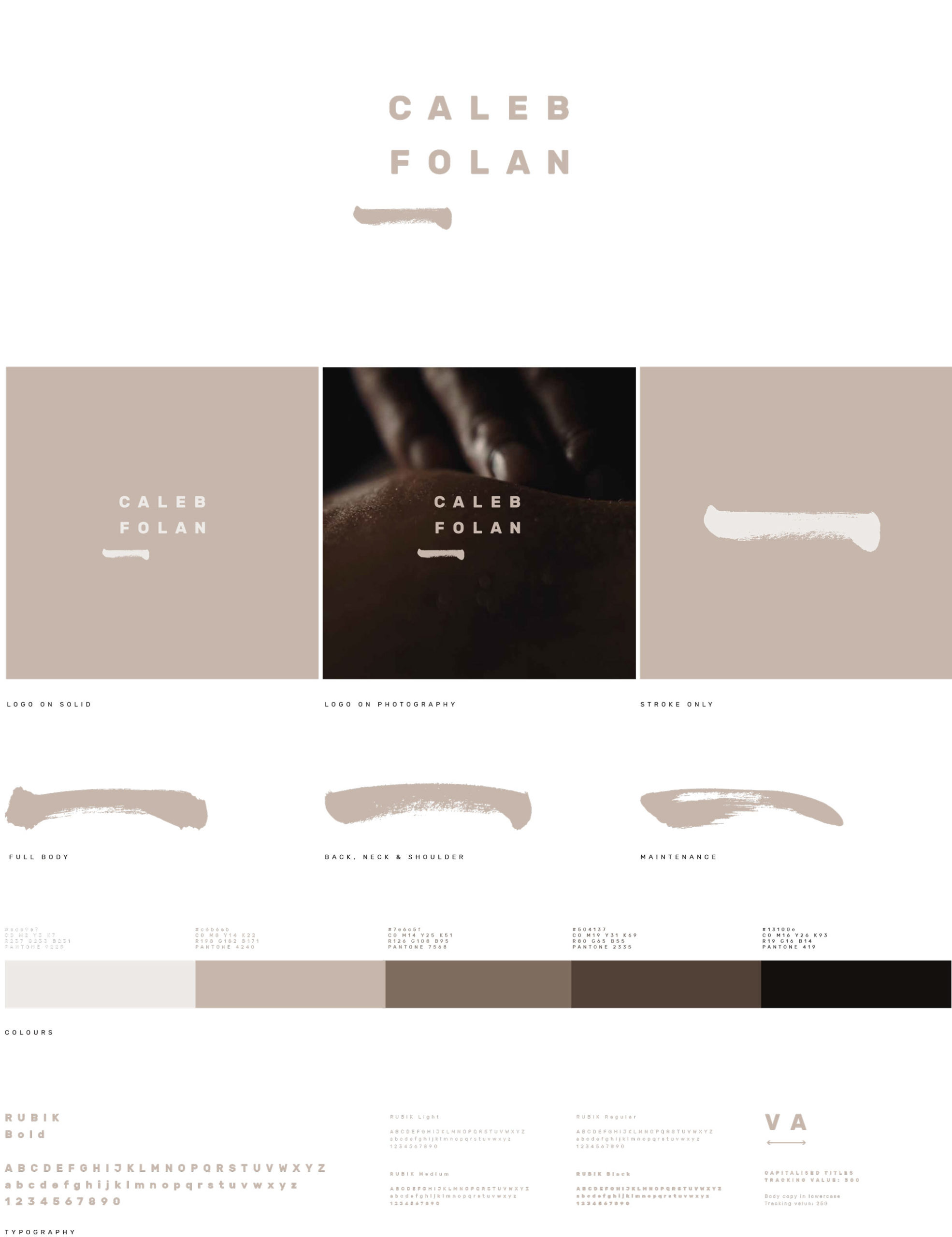
Pressure
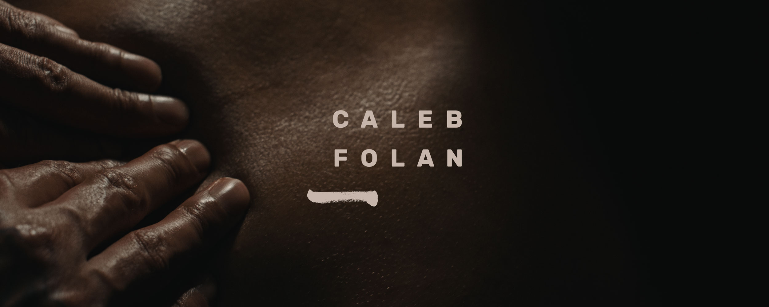
The brand identity was born out of the similarities of massage and calligraphy techniques. Caleb explained to us that variance of pressure in drawing a brush stroke for the Chinese character for the number 1 felt akin to that of finding and relieving tension within the body. We created a range of brush stroke marks to use throughout the visuals and made sure to include a sense of offset harmony throughout. We often seek massage for correction and to reset physically, so it felt natural to intentionally misalign elements of the designs, but in a way which still felt ‘right’.
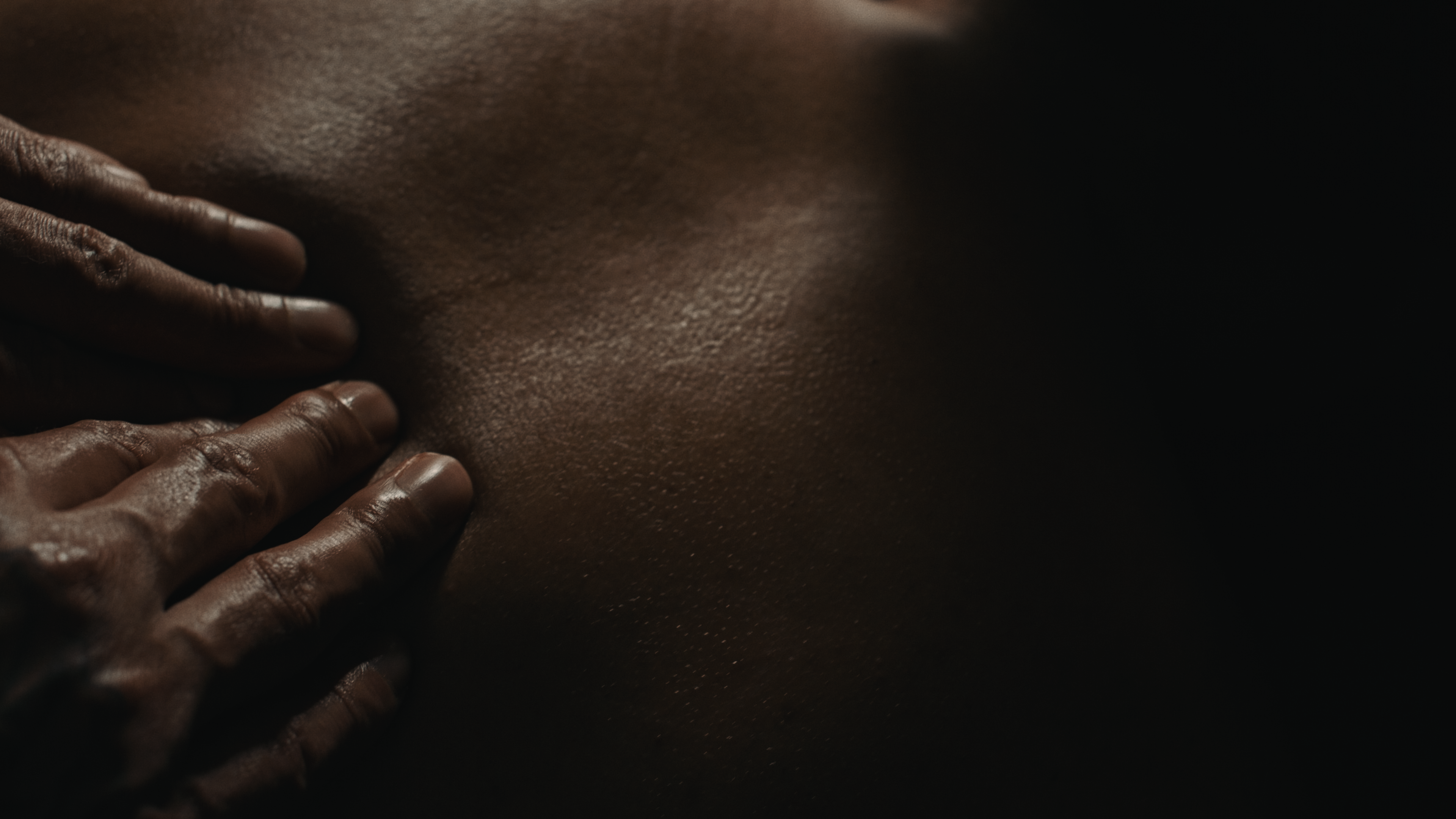
Tension
The brand film took on a life of it’s own taking cues from Caleb’s personal narrative. We started the process by interviewing Caleb and listening to his story and used this as a base to craft a film which encompassed him. A script was built around this interview and the visuals were chosen to echo the vibe of Caleb’s intentions and motivations for turning his hands, literally and metaphorically, to massage therapy.
